Displaying a Variable in a Basic Chart (Line Chart)
This widget allows you to visualize how your variable changes over time. It’s perfect for tracking trends, comparing multiple variables, or analyzing time-based performance.
Step-by-Step Instructions
-
Open Dashboards
In the top navigation bar, click on
Data, then selectDashboards. This will open the dashboard management area.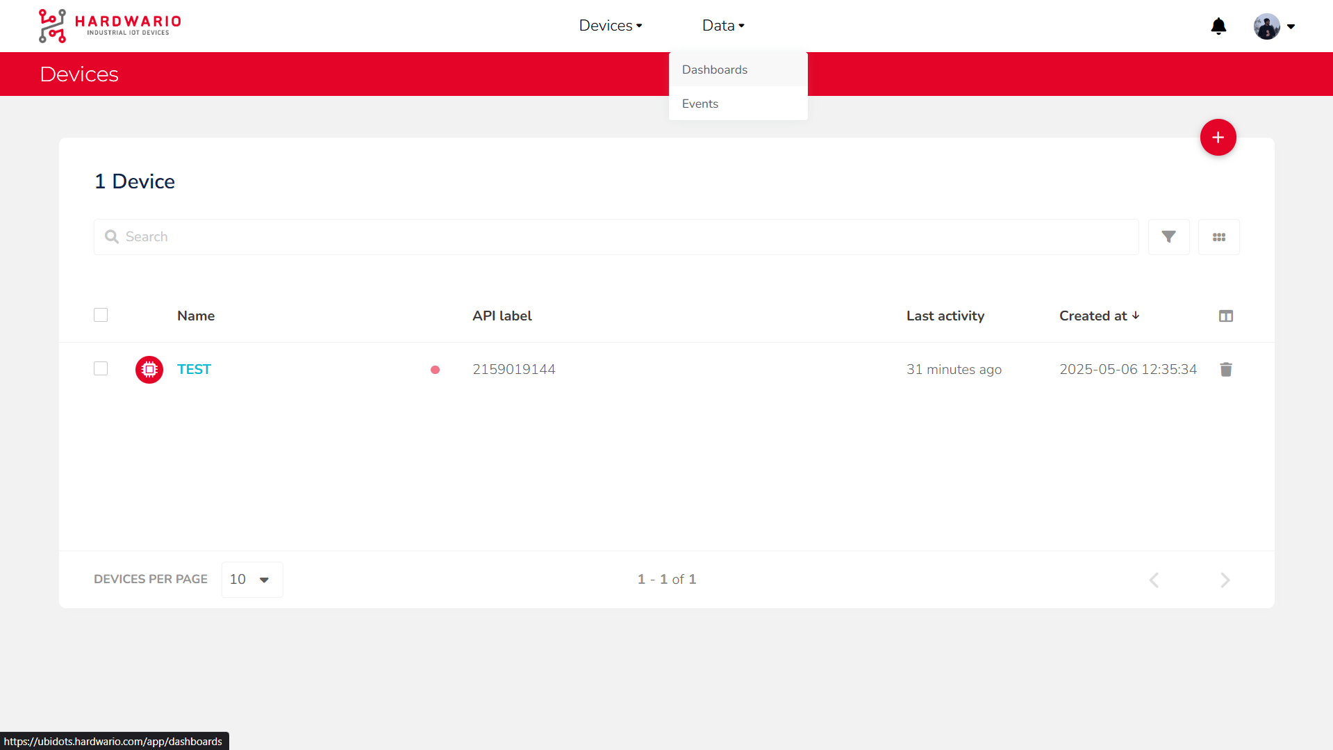
-
Add a New Widget
Click the
Add new Widgetbutton (marked with a + icon).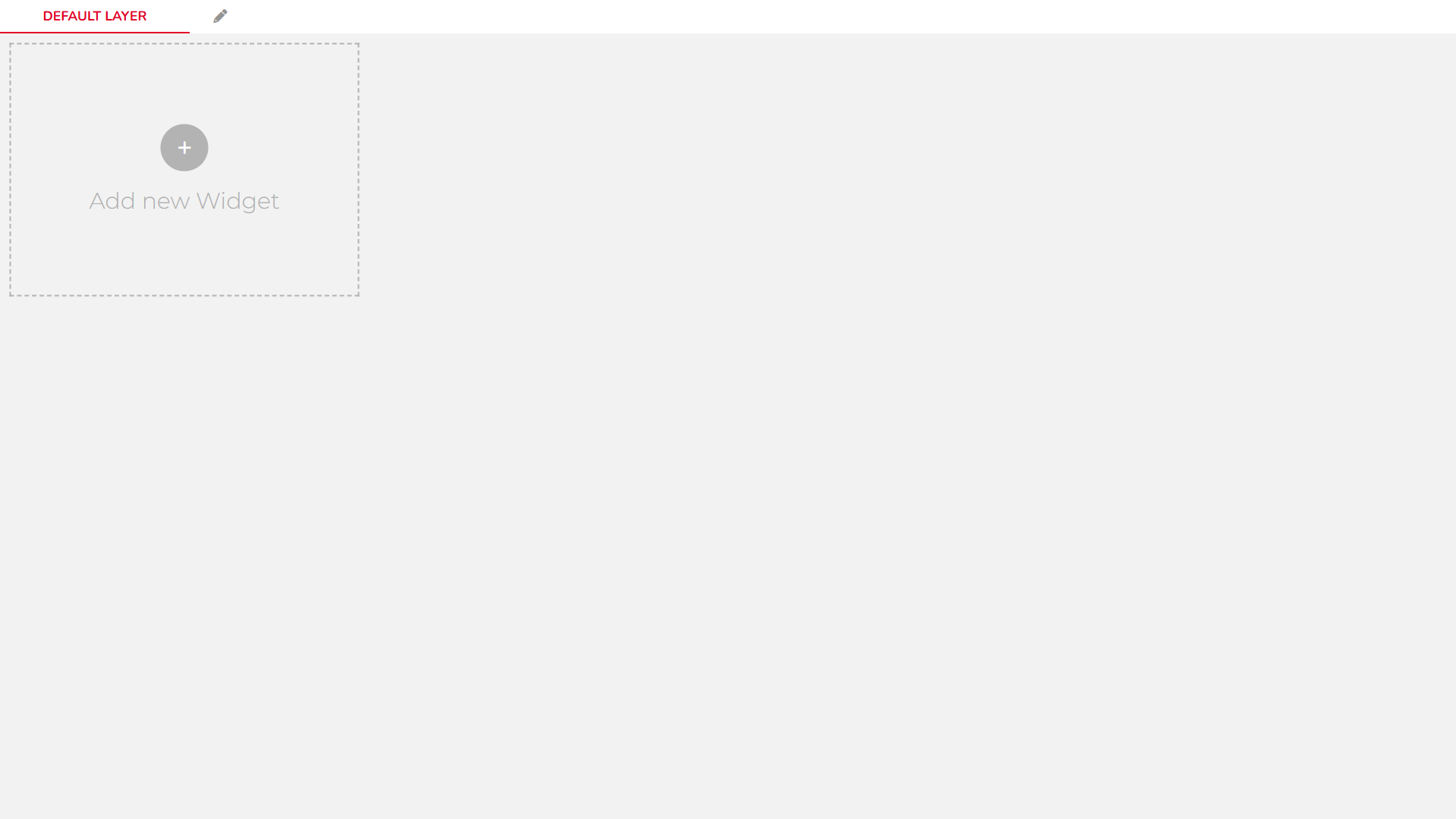
-
Choose a Widget Type
From the list of available widgets, scroll to the
Chartssection and choose aLine Chart.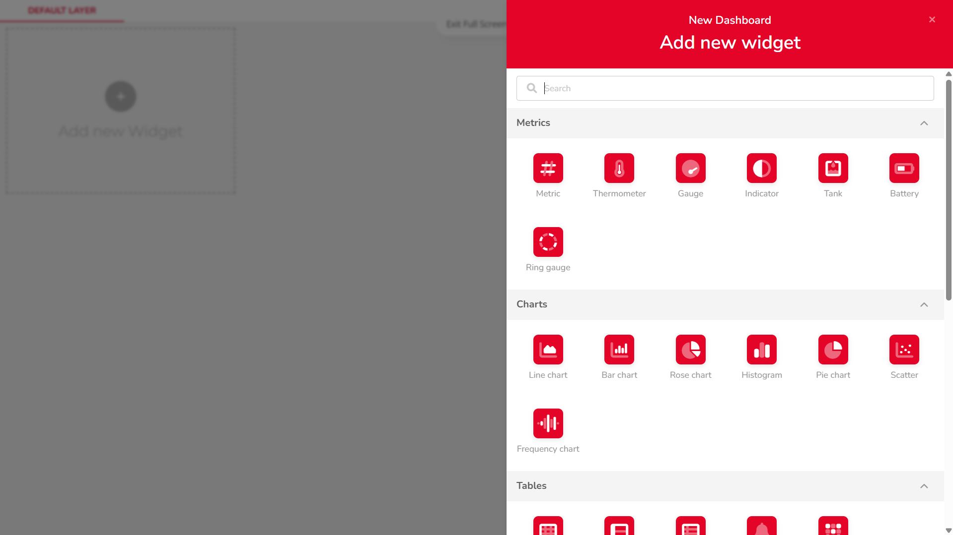
-
Add a Variable
Click on
+ ADD VARIABLES, then:
• Select your device
• Choose the desired variable
• Confirm the selection by clickingSELECT
-
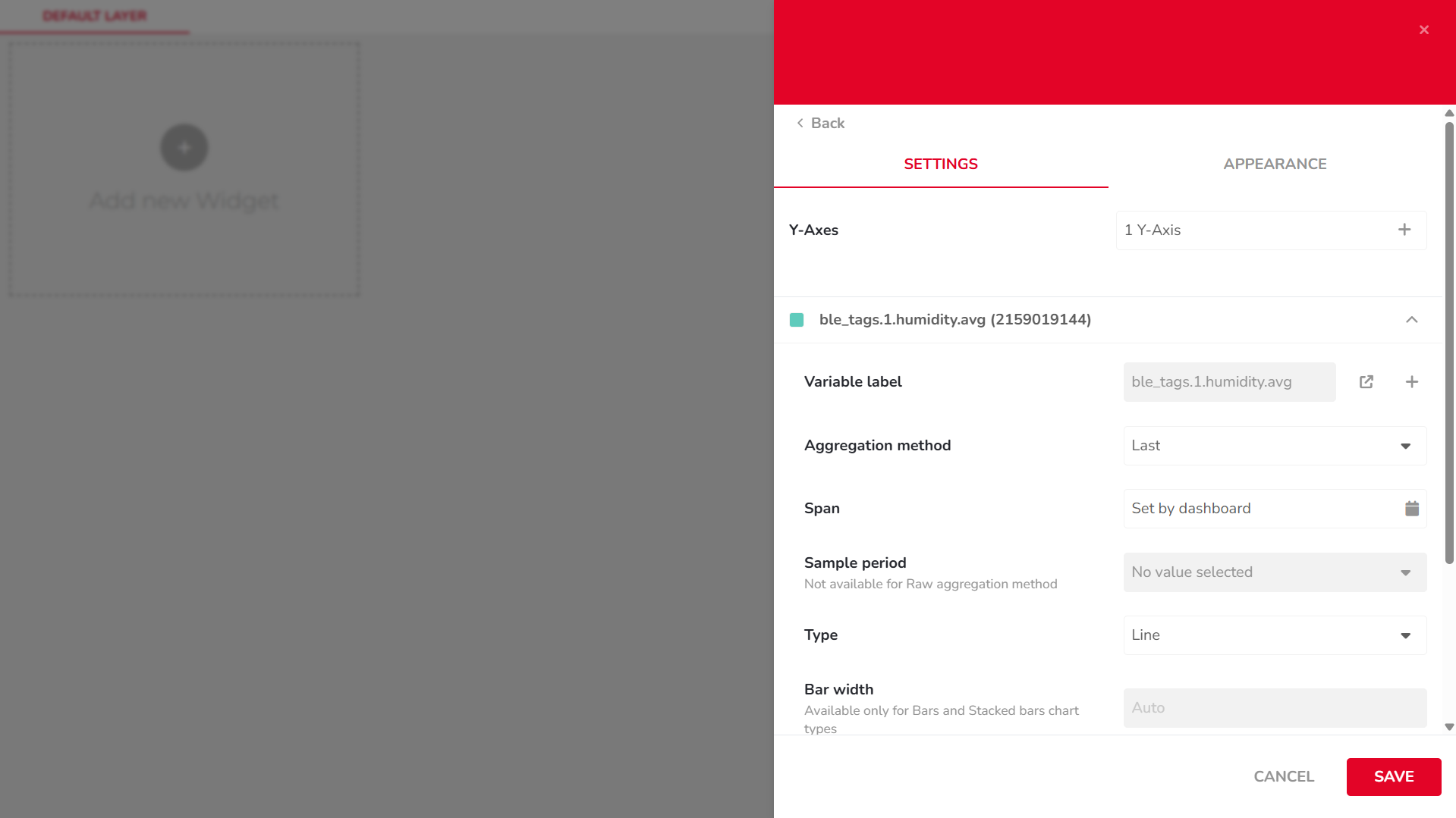
Configure Chart Settings
In the
SETTINGStab, configure options such as:
• Aggregation Method
• Span
• Sample Period
• Bar Width
• ...
-
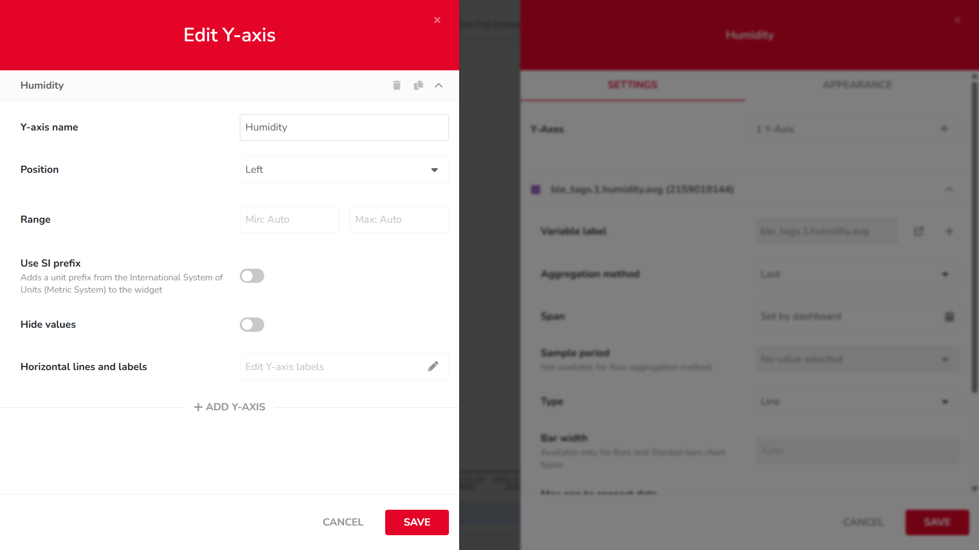
Edit Y-Axis Settings
In the same
SETTINGStab, click the1 Y-Axisbutton to adjust:
• Axis name
• Position
• Value range
• ...
-
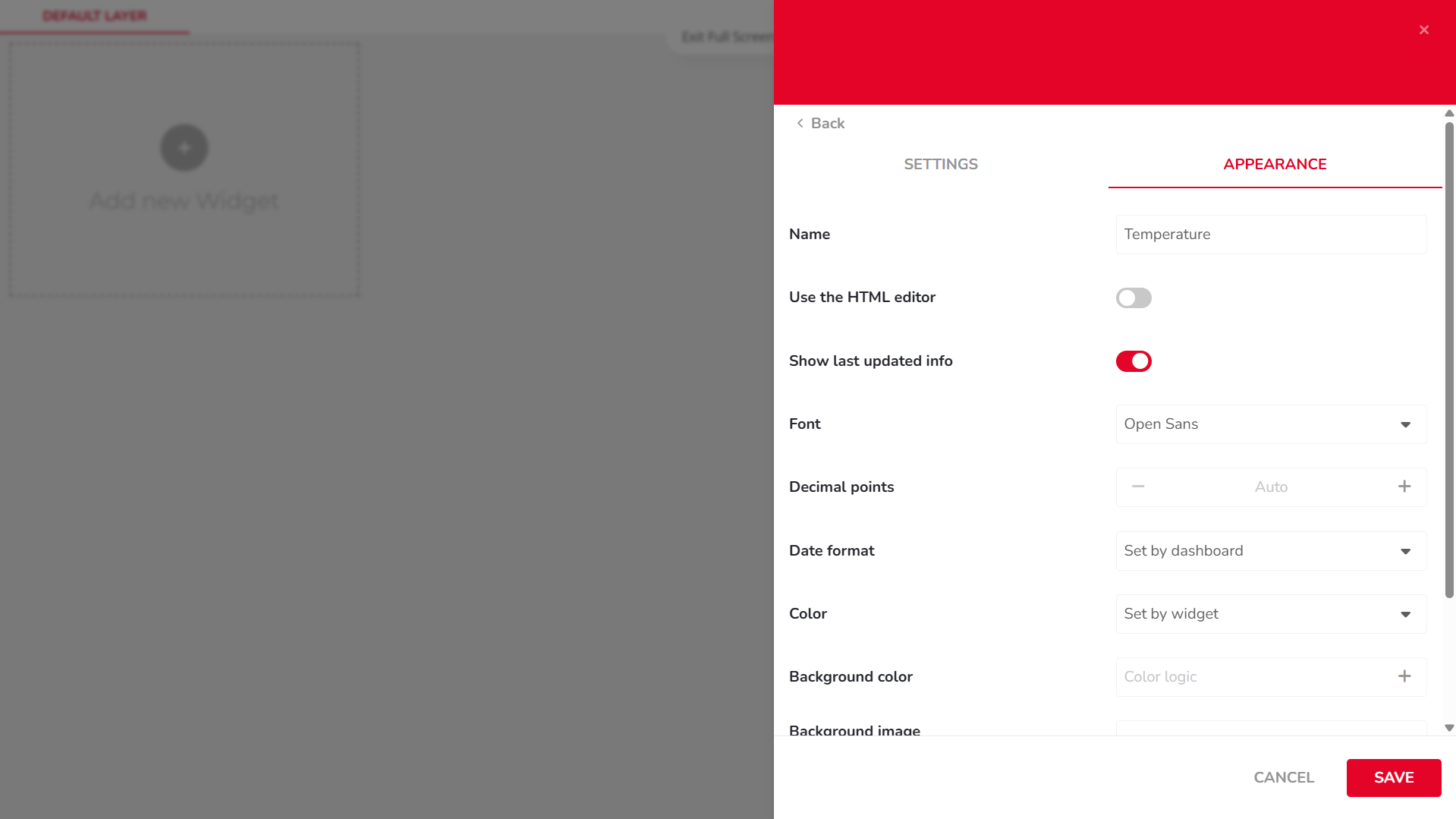
Edit Widget Appearance
Switch to the
APPEARANCEtab to modify visual elements such as:
• X-axis label
• Font
• Date format
• ...
-
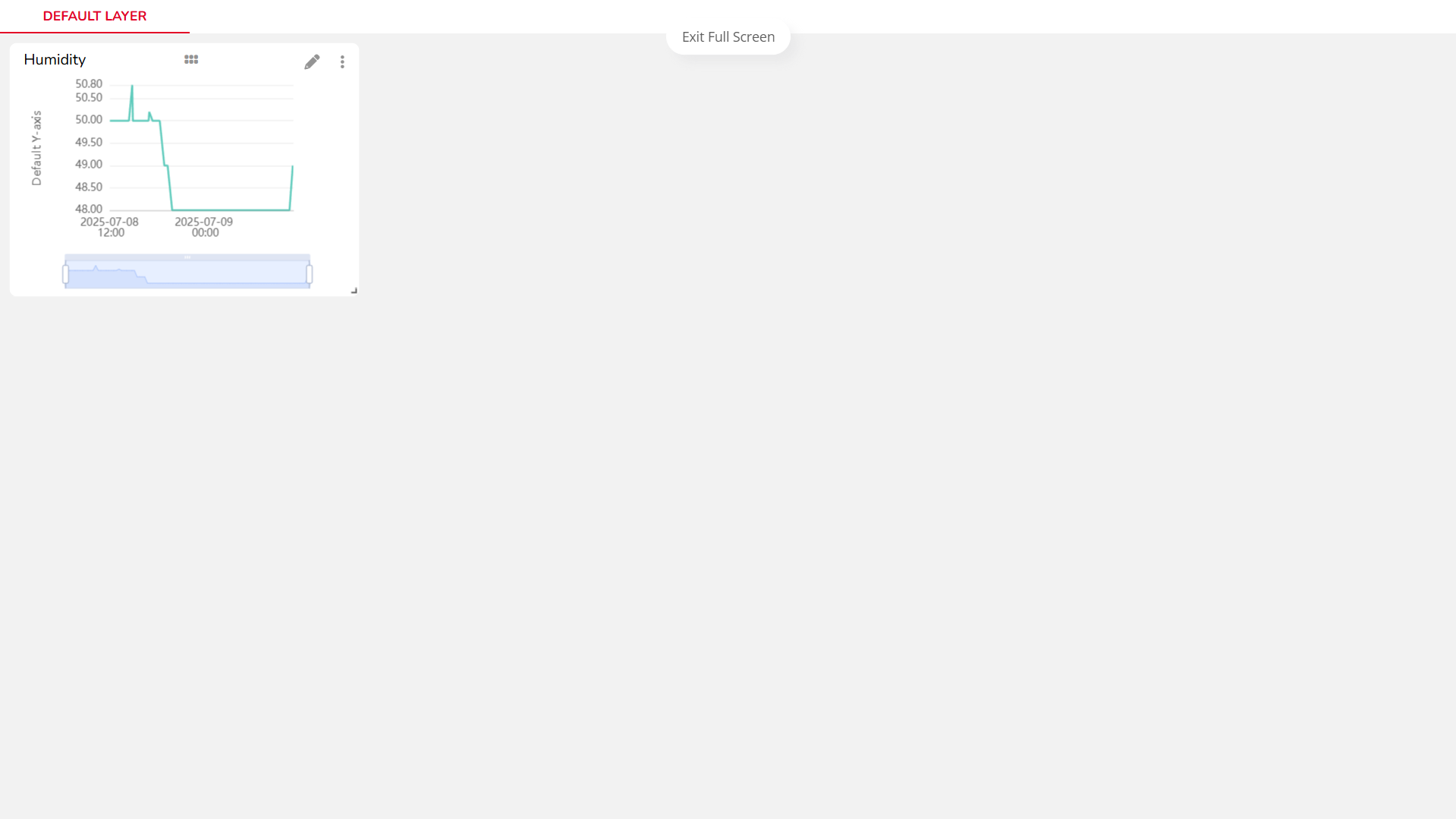
Resize the Chart
Once the widget is added to your dashboard, resize it using the arrow icon in the bottom-right corner of the chart.
-
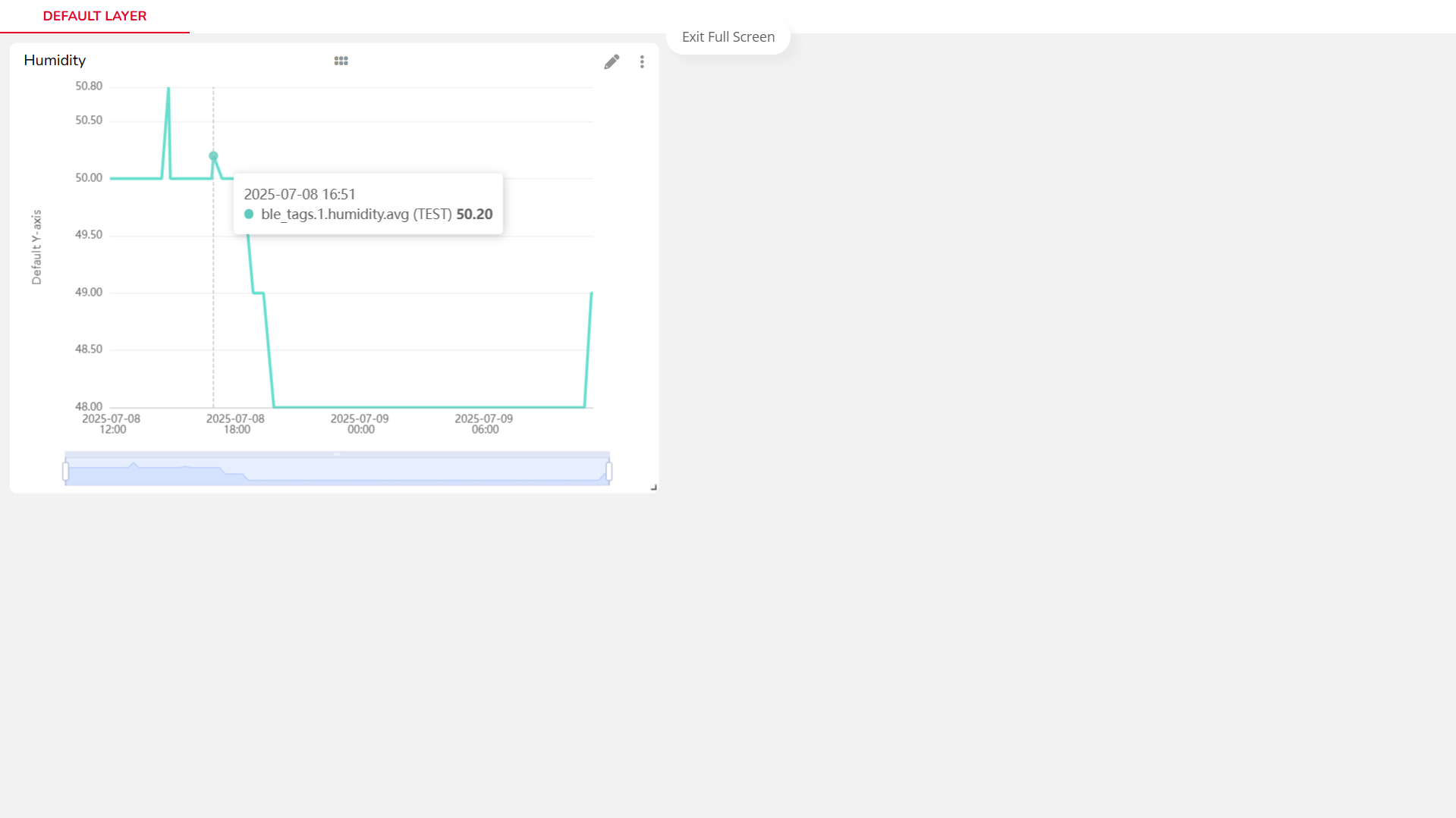
View Data Points
Hover over the chart line to view individual data values as tooltips.
Video Tutorial
If you need further assistance or a visual demonstration of the process described in this guide, consult the Video Guide.