Ubidots
Ubidots is a cloud-based IoT platform that helps developers and businesses design, deploy, and scale IoT solutions with minimal coding. It offers drag-and-drop dashboards, real-time visualizations, alerts, reports, analytics, and white-label options to quickly turn sensor data into actionable insights.
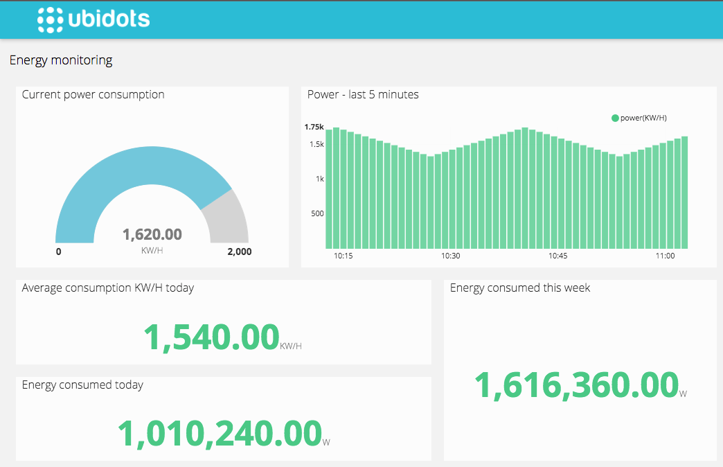
Example of an IoT Data Dashboard
Getting Started
1. Create a Device in Ubidots
Start by logging into Ubidots and creating a new device. This device will act as the endpoint that receives and stores data sent from HARDWARIO Cloud.
Here is a detailed step-by-step guide: 👉 Adding a New Device
Here is a video guide: 🎥 https://docs.hardwario.com/apps/videos-apps/ubidots-new-device
2. Create a Connector in HARDWARIO Cloud
Next, go to HARDWARIO Cloud and set up a Connector that points to your Ubidots device. This connector will securely transmit your device data from HARDWARIO Cloud to Ubidots.
Here is a detailed step-by-step guide: 👉 Connectiong to the Cloud
Here is a video guide: 🎥 https://docs.hardwario.com/apps/videos-apps/ubidots-cloud-connection
3. Create a Dashboard in Ubidots
Once the connection is established and data is flowing, create a dashboard in Ubidots. Add widgets (such as graphs, indicators, and tables) to visualize your data in real time.
Here are detailed step-by-step guides:
Here are detailed step-by-step guides:
| Guide | Link |
|---|---|
| Metric | Open |
| Line Chart | Open |
| HTML Canvas | Open |
| Synthetic Variable | Open |
Here is a video guide: 🎥 https://docs.hardwario.com/apps/videos-apps/ubidots-dashboard